I went out recently with the camera, the idea of a film recipe in my head: What if I tested a Portra 400 recipe created by ChatGPT in actual practice? Portra 400 is known for its dreamy colors, soft contrasts, that certain weightless quality. So I thought – why not see how well an AI could interpret this characteristic aesthetic.
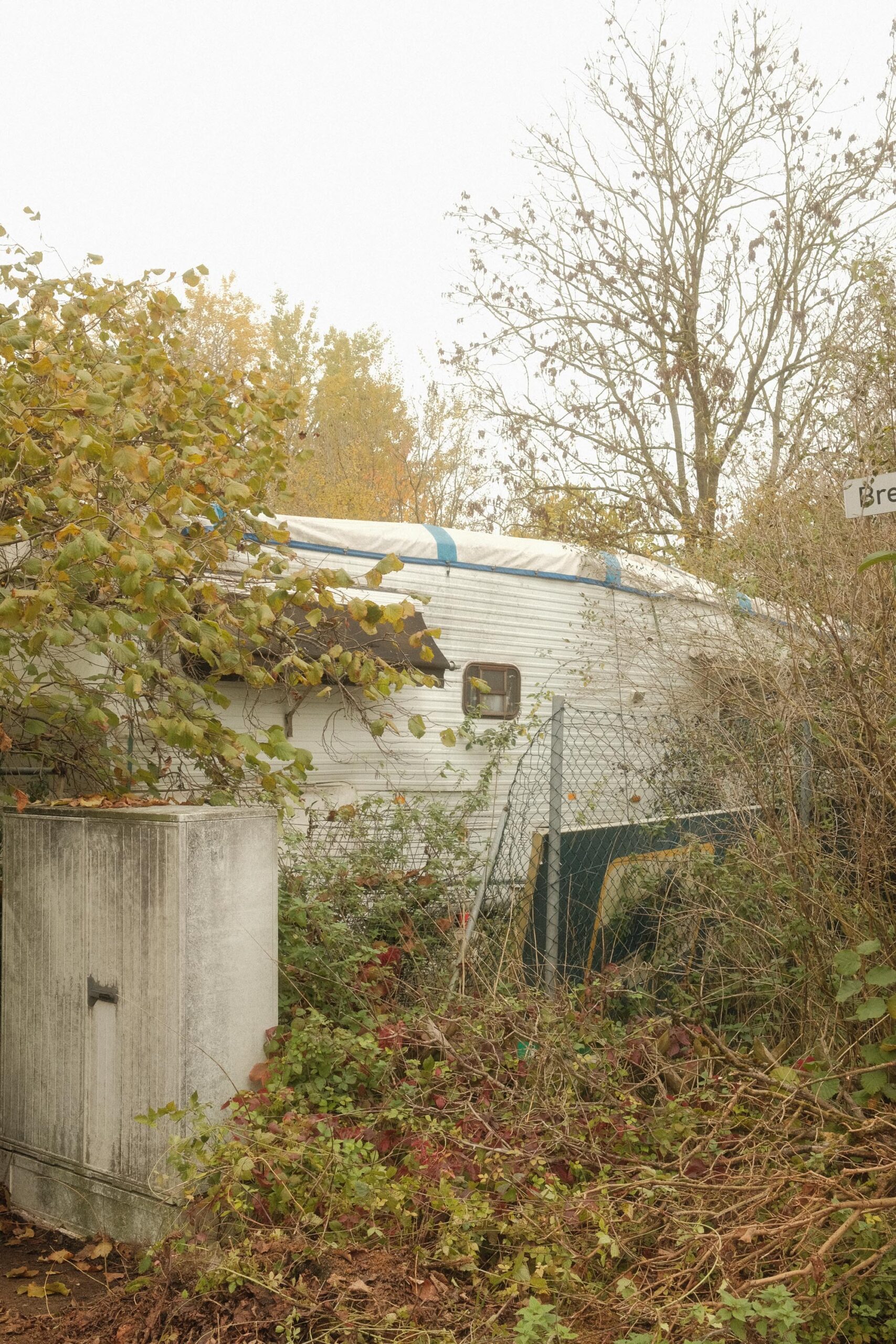
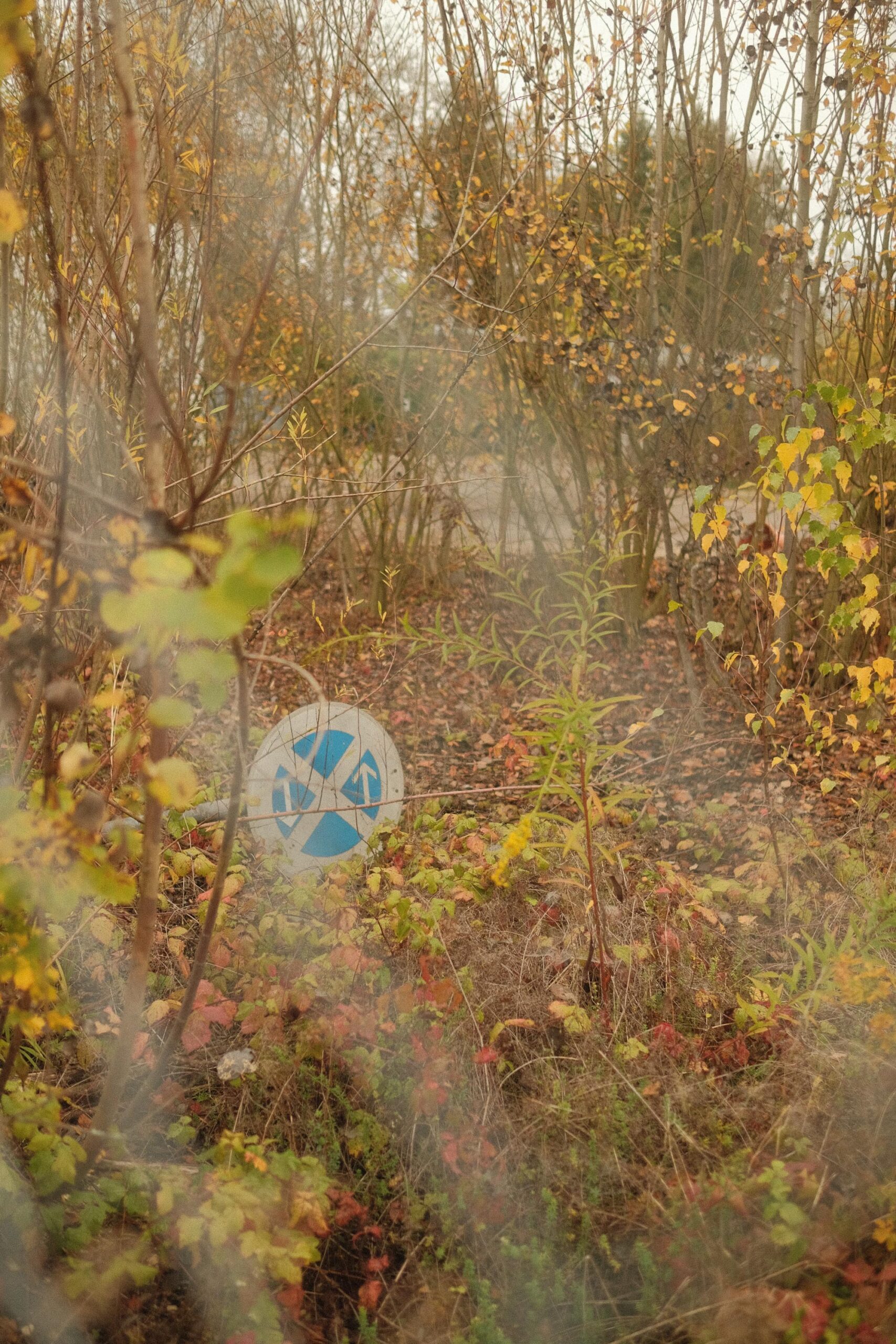
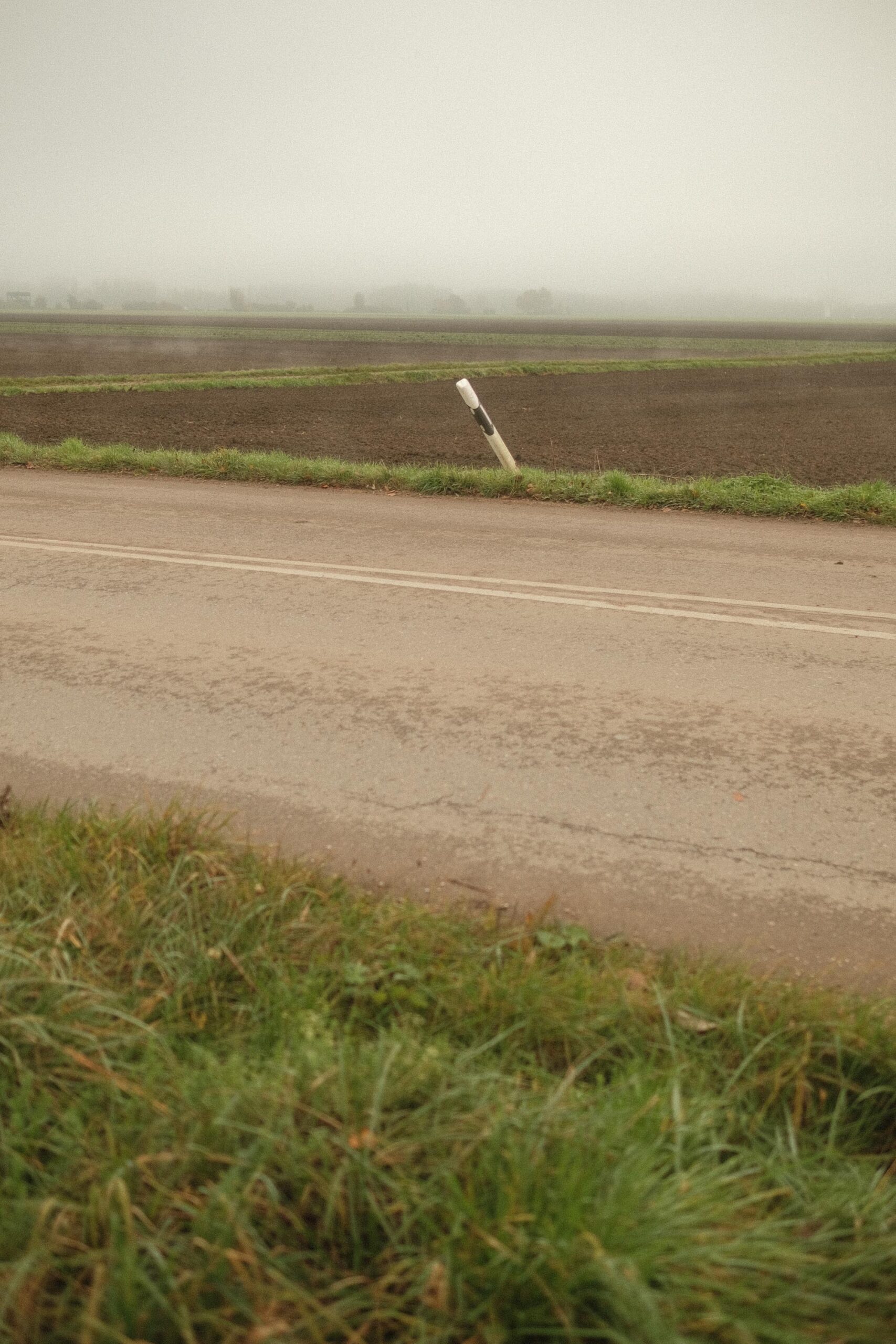
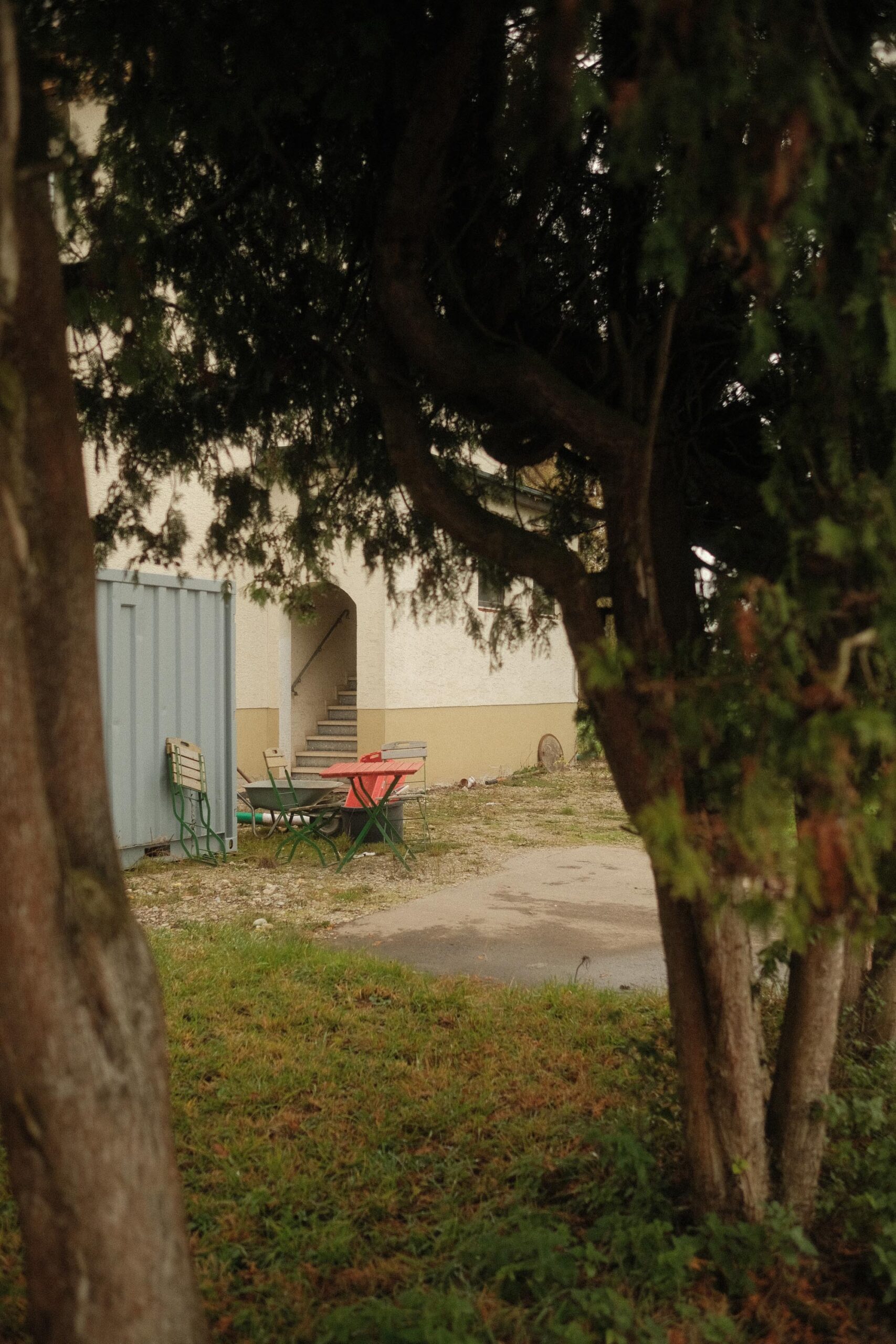
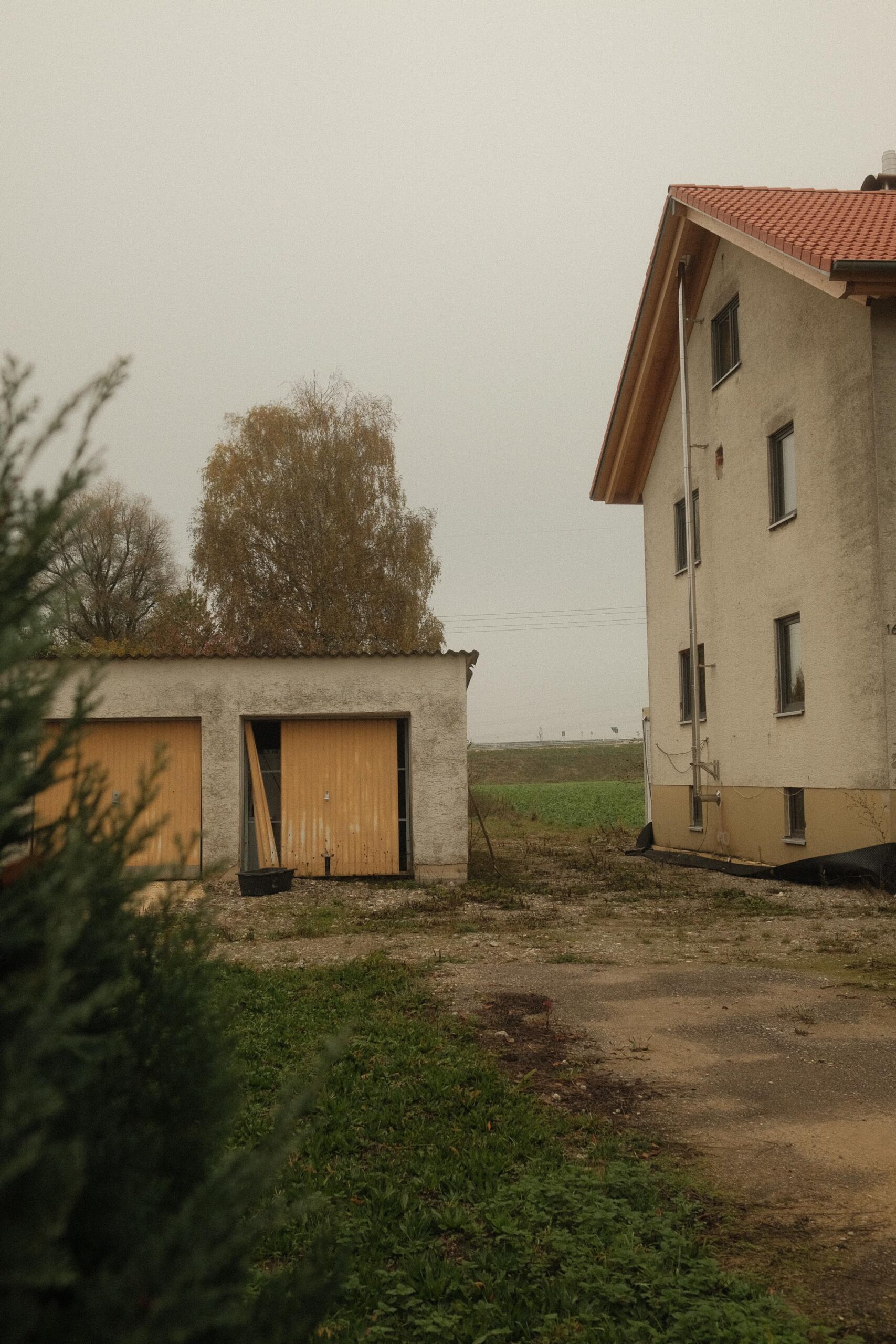
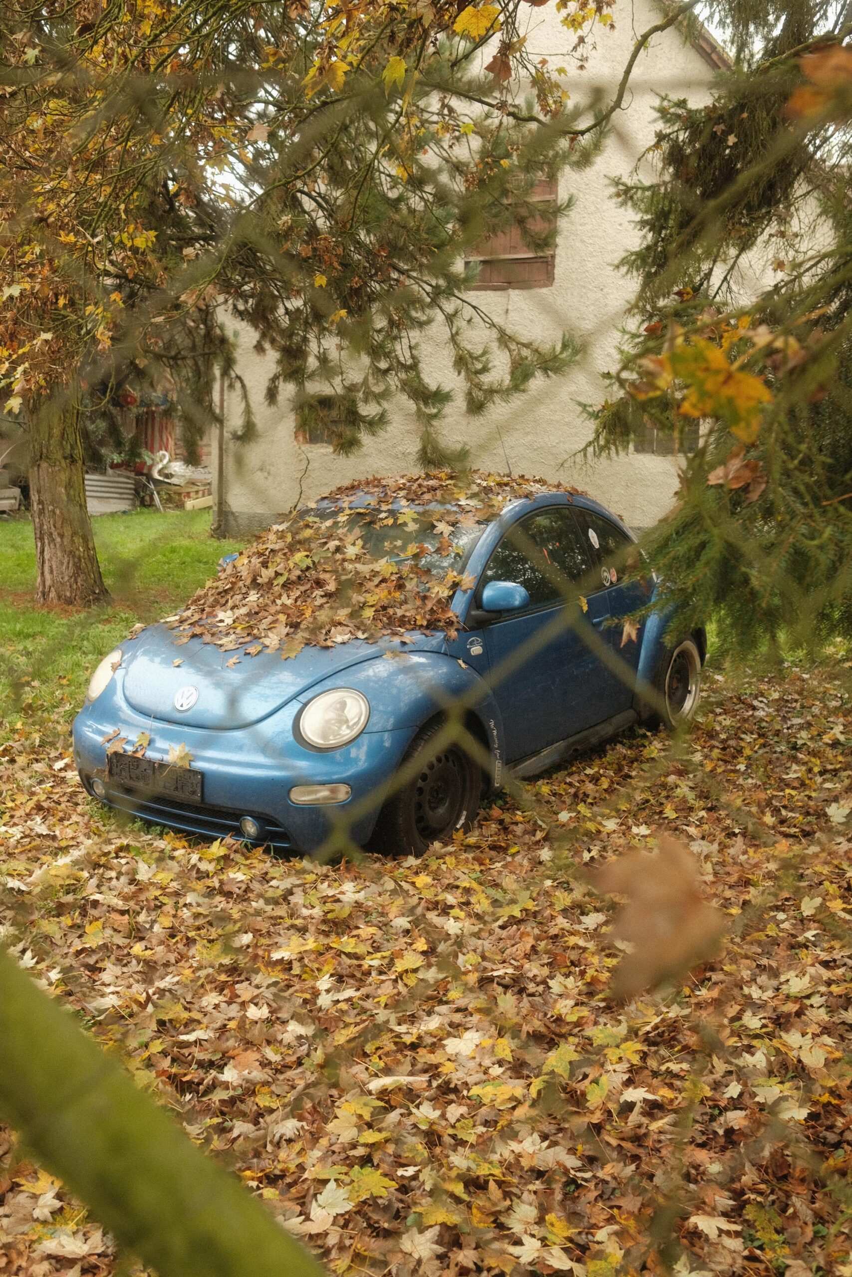
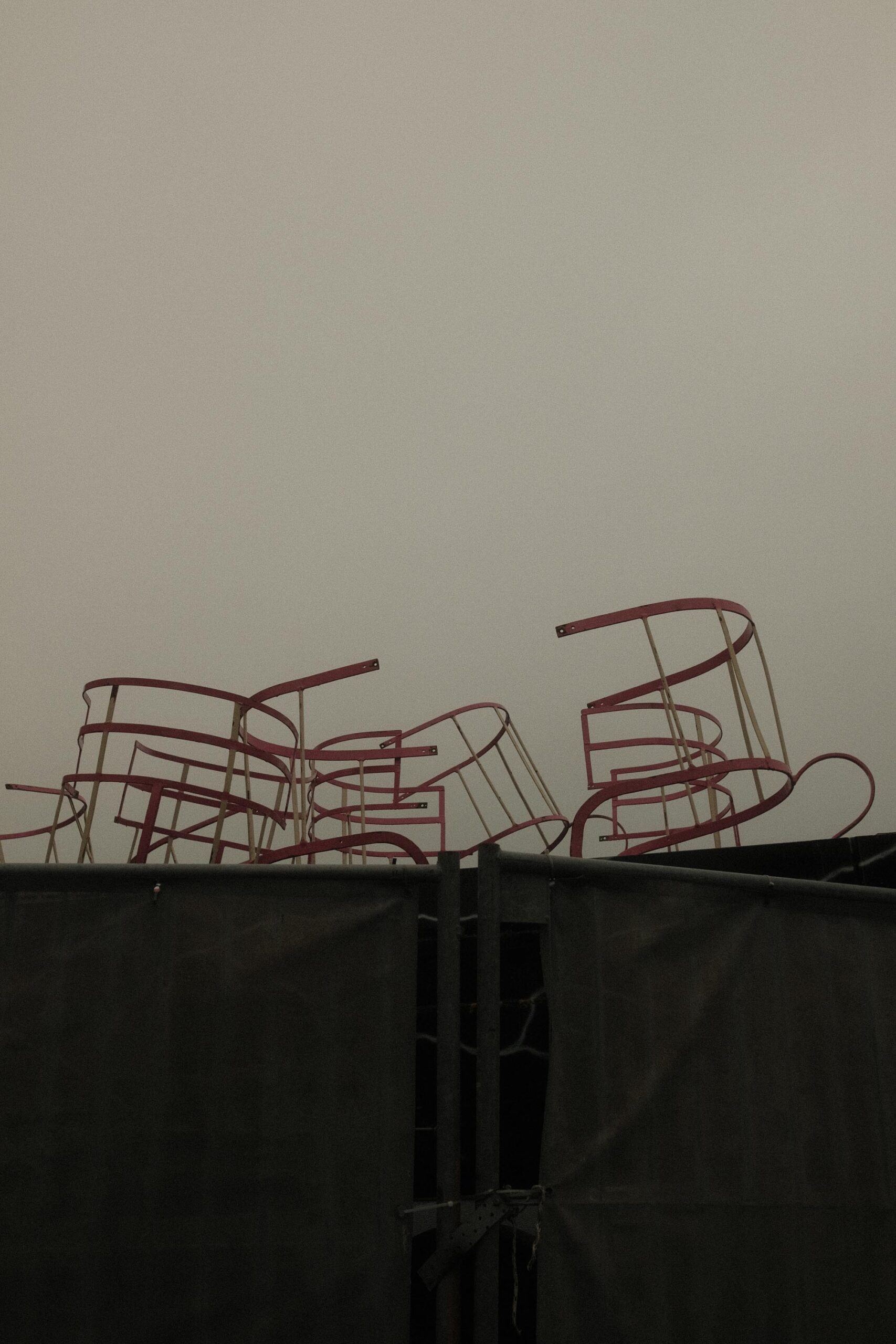
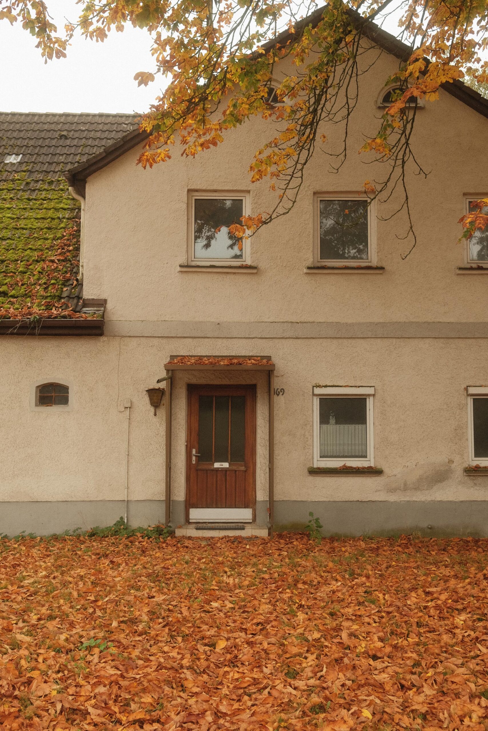
The day was made for it. Autumn fog, that diffuse afternoon light that softens everything, turns every scene a little mysterious. I love how mist wraps the world in gauze. The X-Pro2 had the Fujinon 23mm f1.4 and a Black Promist filter on it.
I moved through the landscape looking for moments that could hold this dreamy, nostalgic feeling. The colors from the recipe were striking – soft tones, warm highlights, a subtle, almost painterly contrast.
Here’s what surprised me: the AI actually understood something about how Portra sees the world. Not perfectly. It’s not the same as real film – the grain is different, the way colors shift is different. But the digital files have their own kind of beauty. Especially combined with that autumn light, they have a quietness to them. A presence I didn’t expect.
So: does it work? Kind of. Does it matter that it came from ChatGPT? I’m still thinking about that. Maybe the interesting question isn’t whether the AI nailed it, but what happens when you start looking for something specific – whether the tool is film or a recipe or your own eye.
Portra 400 Look für Fuji X-Pro2:
- Film-Simulation: Classic Chrome
- Grain Effect: Strong
- Dynamic Range: DR200 (hilft, Details in den Lichtern zu bewahren)
- Weißabgleich:
- Temperatur: 6300K (passt an, je nach Licht, für wärmere Töne)
- Farbverschiebung: +2 Rot / -3 Blau (gibt den leichten Magenta-Stich des Portra 400)
- Highlights: -2 (sanfte Highlights)
- Shadows: -1 (leichtes Aufhellen der Schatten)
- Color: +2 (sättigt die Farben wie beim Portra 400)
- Sharpness: -2 (für eine sanftere Bildschärfe)
- Noise Reduction: -4 (minimiert die digitale Rauschunterdrückung, um mehr Körnung zu zeigen)
Tipps zur Anwendung:
- Belichtung: Leicht überbelichten (+1/3 bis +2/3 EV), um die helle, weiche Optik des Portra-Looks zu erhalten.


